The concept of void and substance runs throughout calligraphy; without void and substance, there is no contradiction, just as a drama without conflict becomes tedious and uninspiring. The structure of characters requires both void and substance, and the layout must also embody this principle. It is important to note that we strive to draw insights from the classical works of ancient sages to aid our calligraphic creations. Generally speaking, areas with loose spacing between characters, lighter strokes, lighter ink application, and drier sections tend to create a sense of void; conversely, areas with tight character spacing, heavier strokes, denser ink application, and moist sections visually convey a sense of substance. Below are some works for exploratory and rough analysis.1. Wang Xizhi’s “Xing Rang Tie”, the initial strokes of “足下” have relatively large spaces between them and are lighter, while the final character “佳” is also light, representing the void part. The section enclosed by the white line has heavier strokes, thus clarifying the overall relationship between void and substance.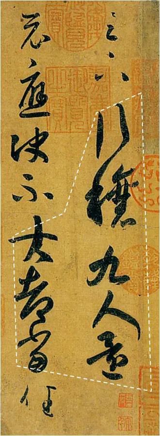 2. Wang Xizhi’s “Mei Zhi Tie”, has three areas where the strokes are handled lightly and fluidly, the parts enclosed by the white line “之可言”, “夕”, and “虑,三” appear more void compared to other areas.
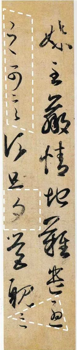 3. Wang Xizhi’s “Er Xie Tie”, the section enclosed by the white line “想邰儿、所送”, along with the larger spacing between “静” and “羲” creates a relatively void area. The lower part “患者善” is also light, forming another void area.
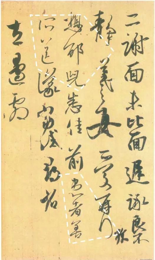 4. Wang Ci’s “Yi Ri Wu? Shen Tie”, this piece clearly delineates void and substance, with a concentrated area feeling very substantial, while other areas appear more void.
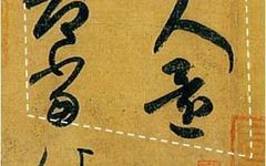
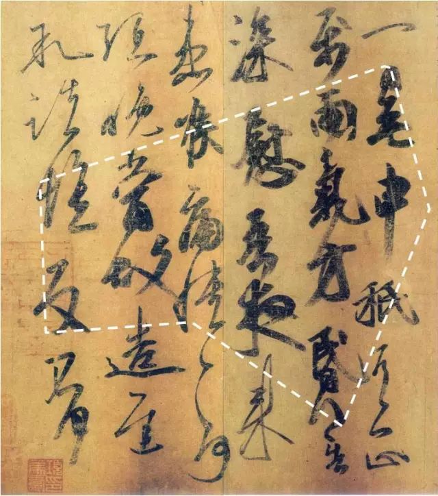 5. Wang Xizhi’s “De Shi Tie”, the lower part has concentrated heavy strokes and dense spacing, giving it a very substantial appearance.
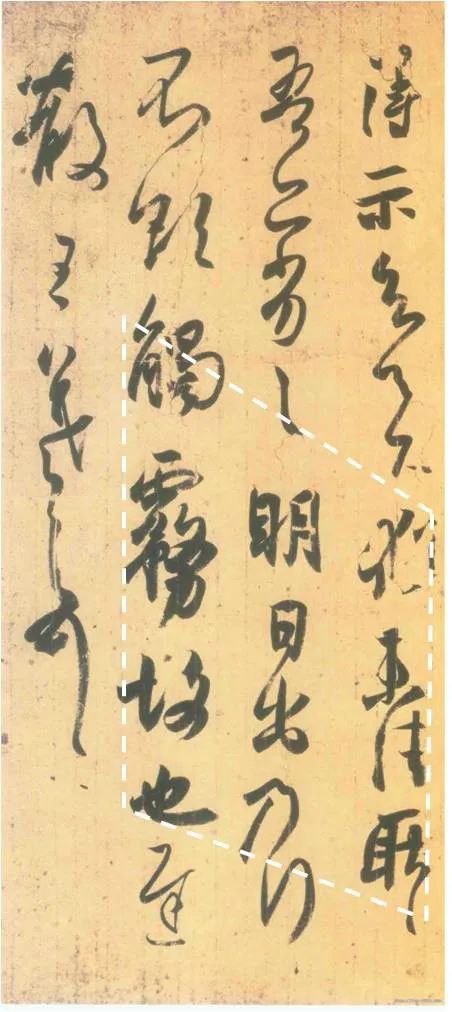 6. Huaisu’s “Ku Sun Tie”, the lower section is dense and heavy, creating a sense of substance.
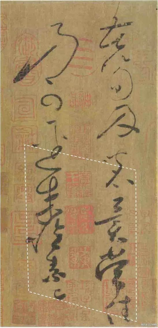 Observing void and substance requires a holistic view, looking at the overall composition and observing by sections, which makes it easier to discover the intricacies within.