Seal Carving Insights
Click the blue text to follow: Free access to 80GB of renowned seal carving collections, tutorials, and instructional videos.
“Void” and “Solid” are the overarching principles in the classification of seal carving techniques. With this guideline, one can pay attention to and master the designs of upper void and lower solid, or upper solid and lower void, left void and right solid, or left solid and right void, surrounding void and central solid, or surrounding solid and central void, etc. Deng Sanmu in his work “Seal Carving Studies” categorizes seal carving techniques into 14 types, which have later been expanded to 25 types, including variations such as weight, increase and decrease, bending and stretching, shifting, interlacing, separation and combination, thickness, straightness and curvature, length and shortness, slant and upright, interspersing, etc. However, under the principle of “Void and Solid”, both the 14 and 25 methods are merely means to achieve the effect of void and solid; each method is not isolated or singular, and in the conception and layout of a seal, multiple layout methods can be integrated.
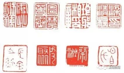
1. Full Solid Method (Examples of full solid seals can be seen in the attached images of “General Anbei Seal”, “Yichun Jin Cheng Seal”, “Langyabao Seal”, and “Liang Qingbiao Seal”)
The Full Solid Method, also known as the Balanced Method, involves evenly distributing the characters within the seal, resulting in a fuller and more solid appearance. The layout is thick and even, with a relatively dense distance between characters. The four corners of the seal are filled, and while there are variations in black and white, there are no drastic changes. For seals with fewer strokes, techniques such as interspersing, overlapping, or area comparison can be used to make the sparse characters appear full and not void. Most strokes are horizontal and vertical, with curves found within straight lines and circles appearing within squares. Whether using a chisel or a knife, a robust approach is preferred. Seals carved using the full solid layout are characterized by their solemnity, simplicity, and grandeur, providing a stable and majestic impression and aesthetic. This type of seal is a classic example of Han seals, rich in tradition, and beginners in seal carving can start by copying these.
To ensure the seal appears “full” and “solid”, additional techniques may be employed as necessary. For instance, adding a white border around the characters in a white seal, treating the characters with a border or top edge, or incorporating a “field” grid, “well” grid, or “cross” grid within the seal to enhance its fullness.
Several points must be noted regarding full solid seals: (1) While ensuring the characters are robust and consistent, variations should be observed. Characters with simpler structures can have thicker strokes, while more complex characters can be slightly thinner. These variations should not disrupt the overall harmony. (2) Within the upright and dignified appearance of the seal, there should be dynamic changes with slants and curves. Full solid seals should avoid being flat and overly rigid; short slanted or curved lines can be used to increase dynamism. (3) While the characters are uniform and tidy, variations in size can be introduced. Full solid seals are often evenly divided, but they should not be rigidly adhered to rules without understanding their variations. The area comparison method is most suitable for designs with significant differences in character complexity and density.
2. Full Void Method (Examples can be seen in the attached images of “Chang Jin Seal”, “Pi Ju Seal”, “Cai Qiao Seal”, and “Xin Bo Shi Seal”)
The Full Void Method refers to seals that primarily feature sparse, void, and light elements, creating a visual effect that is ethereal, concise, and open. The characters generally have fewer strokes, with thin lines and a layout that is relatively empty, with greater distances between characters. For white seals, more red is left; for red seals, more white is left. The lines in this type of seal are generally straight, with curved lines and circles as secondary elements. The carving can be light and shallow, emphasizing a dignified, elegant, and slender style, leaving room for imagination and reflection. This type of seal was commonly seen in the pre-Qin and Warring States periods, and has been expanded upon by seal carvers throughout history. Due to its concise nature and subtle line variations, this type of seal is favored by beginners.
Seals carved using the full void method typically have thicker borders, primarily to highlight the “void” of the seal, creating a contrast between void and solid. If full solid seals evoke a scene of red clouds filling the sky or white clouds in abundance, presenting a sense of fullness and satisfaction, then full void seals represent a vast blue sky with a few wisps of clouds, embodying a sense of openness, clarity, and tranquility, filled with imaginative landscapes.

3. Upper Solid and Lower Void Method
In this method, the focus shifts upward, with the characters distributed in the upper part of the seal, creating an effect of fullness and solidity above, and sparsity and void below, as seen in the attached images of “Qian Chaobai Seal”, “Cao Family Seal”, “Shutang Seal”, and “Zhongzhu Daoren Seal”. Seals designed in this manner can evoke a sense of comfort, solemnity, and elegance. There are several methods for designing this type of seal. First, the upper part can contain characters while the lower part is void, or the upper characters can extend and droop downwards. Second, the upper characters can be robust while the lower characters are smaller. Third, the upper characters can be dense, employing methods such as increasing complexity or curves to make the upper part full, while the lower characters can be sparse, using reduction or fewer curves to create a void effect. Fourth, the upper part can have many characters with rich content and complex structures, while the lower part can have fewer characters with simpler content, presenting a void. Fifth, the upper characters can be thick and clear, while the lower characters can be thin, blurred, or intermittent. Sixth, the upper characters can be larger to appear solid, while the lower characters can be smaller to appear void.
In summary, to achieve the upper solid and lower void effect, one can use methods such as increasing strokes, overlapping, densifying, and weighting in the upper part to reflect solidity, while employing reduction, fewer curves, and simplification in the lower part to reflect void. This type of seal is commonly seen in ancient Qin and Han seals, and many renowned seal carvers from the Ming and Qing dynasties have created remarkable works with this design.
4. Upper Void and Lower Solid Method
In this method, the focus also shifts upward, with characters distributed in the upper part of the seal, creating an effect of fullness and solidity above, and sparsity and void below. Seals designed in this manner can evoke a sense of comfort, solemnity, and elegance. There are several methods for designing this type of seal. First, the upper part can contain characters while the lower part is dense, with many characters and a solid structure; the upper characters can be fewer, with a loose structure, naturally leaving space. When the upper characters are fewer and the lower characters are more, the upper characters can be smaller and thinner to represent “void”, while the lower characters can be larger and thicker to represent “solid”. Additionally, the effect of upper void and lower solid is closely related to the carving technique. When carving the upper lines, the knife should be shallow and light, leaving more space between characters; when carving the lower lines, the knife should be deep and heavy, with characters closely arranged and minimal space left. Such seals exhibit a strong contrast between the upper and lower parts, with clear distinctions between void and solid. The open and ethereal quality resembles the sky above, while the solid and substantial quality resembles the earth below, aligning with human aesthetic perceptions of natural forms.
5. Left Solid and Right Void Method
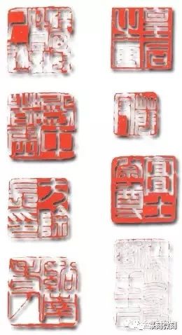
This type of seal is quite common among ancient seals, Han seals, and even modern seal carvers. Especially in modern times, carvers have enhanced the contrast and strength of the left solid and right void, making the solid areas more solid and the void areas more void. Theoretically, left solid and right void represent an artistic imbalance, with the center shifted to the left, creating a visual sense of slant. However, seal carvers use their techniques to enhance the quality of points and lines, enriching the content, making the solid areas appear less solid and the void areas appear less void. Both coexist harmoniously within the limited space, complementing each other. In reality, the solid areas merely have fewer gaps and more characters, while the void areas have more gaps and fewer characters, and the gaps in the seal provide a contrasting supplement to the number of strokes. A careful observation of such works reveals that the solid area on the left appears more rhythmic and elegant due to the clear contrast and reflection of the void on the right. Examples of Han seals such as “Wang Zun”, “Lü Hei”, and “Qian Ren Du Seal” utilize the number of characters for layout, placing more characters on the left and fewer on the right to create a left solid and right void effect. Some seals place only one character on the right, with the rest on the left. Additionally, methods such as reducing strokes, using thin lines, and shrinking character shapes can enhance the sense of “void” on the right, while methods such as increasing strokes, adding curves, thickening, and enlarging character shapes can enhance the sense of “solid” on the left. For instance, in the Han seal “Wang Bing’s Seal”, if the characters “Wang” and “Bing” are thickened and curved, it becomes difficult to achieve the “right void”; if the character “Zhi” is not curved or thickened, it will not present the “left solid”.
6. Left Void and Right Solid Method
This type of seal is also quite common in ancient seals, Qin and Han seals, and is favored by modern seal carvers. For example, in the Han seal “Wei Yi”, characters with fewer strokes or simpler strokes are placed on the left, creating a sparse and void appearance; characters with more strokes or denser strokes are placed on the right, creating a solid appearance. Another example is the seal “Wenzhu Men Zhang Hu”, which arranges multiple characters in three lines, placing a single character or a simpler character in the last line to achieve a “void” effect. Generally, seals from the pre-Qin and Han periods exhibit varied and intricate layouts. The left void and right solid format, while having more empty space on the left and simpler characters, showcases a distinctive style due to the effective use of carving techniques, with the right side having fewer gaps and denser characters, yet appearing completely natural and fitting, embodying the perfect artistic spirit of left void and right solid. For instance, Deng Sanmu’s “Lu Zhong Ren” seal has only one character on the right, with robust strokes, while the left side has two characters with fewer strokes, and the character “Ren” is positioned higher, leaving a large area of red space below, maximizing the sense of “void” and enhancing the contrast and distinction between left and right; the slant of the character “Ren” also adds a dynamic effect, bringing life to the entire seal. Additionally, using lighter strokes, thinner lines, and smaller characters on the left, while using heavier strokes, thicker lines, and larger characters on the right can also alter the void and solid relationship of the seal.

7. Void Corner Method
In the art of seal carving, particularly with square seals, the Void Corner Method is very common. Void corners can be found in the upper left, upper right, lower left, or lower right corners. For example, the Han seal “Han Xiongnu Hu Lu Zhi Shi Zhu” has a void in the upper left corner, “Dian Zhong Du Wei” has a void in the lower right corner, “Fang Chu Chang Yin” has a void in the upper right corner, and Wu Changshuo’s “Xi Nan Lao Ren” has a void in the lower left corner.
To achieve the effect of a void corner, the following methods are generally employed: first, placing characters with fewer strokes; second, making the characters in the desired void corner thinner while keeping the other three corners thicker to create a contrast; third, making the characters in the void corner smaller, occupying less space and leaving more void, while making the characters in the other corners larger, occupying more space and leaving less void; fourth, leaving the void corner without characters, allowing some lines from the upper characters to extend downwards; fifth, making the characters in the void corner appear void through reduction, fewer curves, and finer details, while the characters in the other corners are made solid through increased curves, more strokes, and heavier details. Leaving one corner of a seal somewhat void is akin to leaving a highlight or breathing space in a painting, serving as a form of adjustment in layout and enhancing the spatial awareness of the design. This type of seal is vibrant and full of interest.
8. Diagonal Void and Solid Method
In seal carving, square seals are the most common, but there are also many long, round, and irregularly shaped seals. Regardless of the shape, there are typically four corners, and when the opposite corners are treated with void and solid methods, it is referred to as the Diagonal Void and Solid Method. From an angle and position perspective, it can have the upper left and lower right as void, and the upper right and lower left as solid, as seen in the “Empress Seal”; or it can have the upper left and lower right as solid, and the upper right and lower left as void, as seen in the “Xue Shou Seal”. In terms of characters, it does not necessarily have to be four characters; it can have two, three, or more than five characters. To achieve the diagonal void and solid effect, characters with fewer strokes are generally placed in the opposite corners. In the Han seal “Yi Tu Ji Zun”, the character “Ji” has many strokes, so methods such as reducing curves, fewer interlacings, and shortening lines are used to create a void in contrast to the character “Tu”, which is made solid through increased strokes, thickening lines, and enlarging the character. Deng Shiru’s seal “Jiang Liu You Sheng Duan An Qian Chi” has many characters, yet the diagonal void and solid effect is distinct and strong, filled with a wave-like rhythm and movement, with a balance of density and sparsity, creating an irresistible charm that captivates the viewer.


