
In a piece of running script calligraphy, various changes are always employed: the size of the characters varies, the posture is upright or slanted, the interaction between characters is responsive, the spacing and density of lines create a balance of reality and illusion, the weight and speed of the brush strokes, and the strength and fluctuation of the brushwork, among others. All these aspects of change need to be unified under a certain style, balanced within a limited space, allowing each line, each character, and even each stroke to complement each other, creating a harmonious organic whole.
In running script calligraphy, there should also be a concept of “mutual generation of reality and illusion.” “Reality” refers to the strokes on the paper, which are the black areas with ink; “illusion” refers to the blank spaces on the paper, which are the white areas without ink. Laozi said: “Know the white and guard the black,” which refers to the philosophical understanding of reality and illusion, a method of understanding and harmonizing the contradictions of all things in the world. Applied to calligraphy, this means balancing the relationship between black and white; too much black results in a dense and suffocating feel, while too much white leads to a sparse and loose sensation. The beauty of transparency should also be present in running script calligraphy, where the elegance of the work often lies in the clever use of “white,” reflecting the charm and refinement of calligraphic art in the “illusion” areas. Deng Shiru said: “In sparse areas, one can ride a horse; in dense areas, one cannot let the wind through; always consider white as black, and the unique charm will emerge.”
In handling the structure of running script calligraphy, one must “make the illusory real and the real illusory,” where reality exists within illusion and vice versa, complementing and generating each other, allowing characters and lines to merge into one, tightly interwoven. Therefore, Liu Xizai said: “In ancient people’s cursive script, there is little blank space but a distant spirit; with much blank space, the spirit is dense.” More blank space actually highlights the density, with the beauty lying in the alternation of line thickness and strength, the changes in brush movement, and the variation in character size and height, creating an effect of mutual generation of reality and illusion. Each character interlocks, each line competes, where they compete and interlock, they push and embrace each other, while in places of yielding and evasion, they respond from afar, creating a free and flowing artistic style of cursive script.
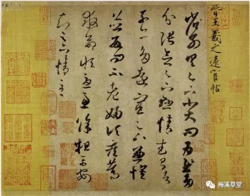
Let’s see how the Sage of Calligraphy, Wang Xizhi, and other sages handled the relationship between reality and illusion in their daily writing:
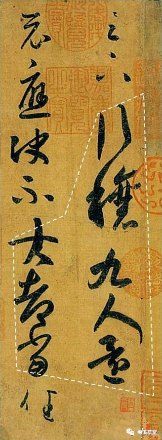
1. In Wang Xizhi’s Xing Rang Tie, the initial “Zuxia” has relatively large spaces between strokes and is written lightly, while the final “Jia” is also light, representing the “illusion” part. The middle section, enclosed by white lines, has heavier strokes, making the overall relationship between reality and illusion quite clear.
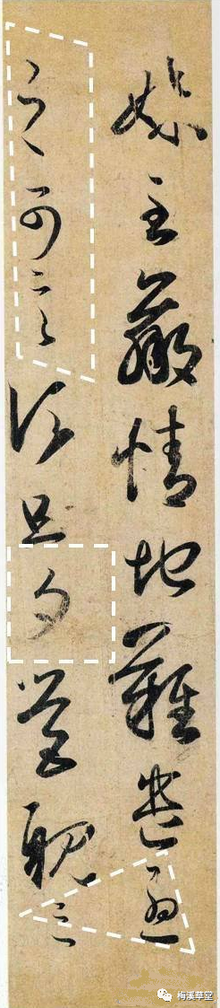
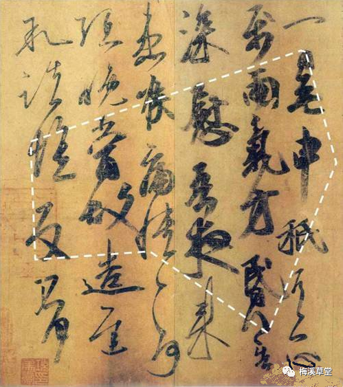
2. In Wang Xizhi’s Mei Zhi Tie, there are three places where the strokes are handled lightly and dynamically, with the white lines enclosing “zhike yan,” “xi,” and “lv,” appearing more “illusory” compared to other areas.
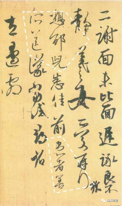
3. In Wang Xizhi’s Er Xie Tie, the white lines enclose “xiang tai er, suo song,” and the spacing between “jing” and “xi” creates a relatively illusory area. The lower part “huanzhe shan” is also light, forming another illusory area.
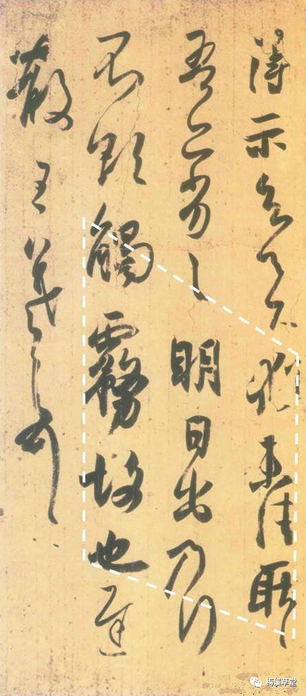
4. In Wang Ci’s Yi Ri Wu. Shen Tie, the distinction between reality and illusion is quite clear, with a concentrated area in the middle feeling very “real,” while other areas are more “illusory.”
5. In Wang Xizhi’s De Shi Tie, the lower part has concentrated heavy strokes, creating a dense feel, appearing very real. In the piece, the character “wu” is written large, thick, and solid, making it the heaviest “beat” in the work. Conversely, writing characters small, airy, thin, and illusory, like “tian” and “xia,” makes them the lightest “beat” undoubtedly. We find that any point between the heaviest and lightest beats can be reproduced.
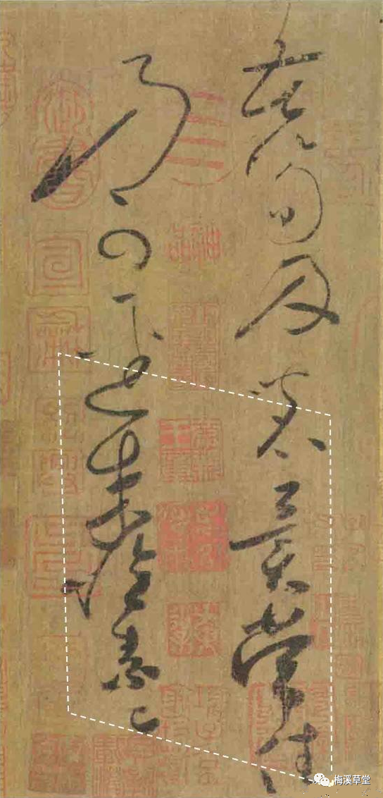
6. In Huaisu’s Ku Sun Tie, the lower part is dense and heavy, creating a feeling of “reality.”
Observing reality and illusion, one should summarize from an overall perspective, observing in blocks, which makes it easier to discover the intricacies within.